So, slightly prompted by this, and by my wish to revisit this, I took a look at the 100 most wished for books on Amazon and did a little bit of analysis.
The facts: I looked at this list on 9th September 2013, over a several hour period (ie: once in the morning before work, and once after). Therefore the actual order of items may have changed and will have changed if you look at it now. Also, remember that this is a list of those that are most wanted – not bestsellers.
So, with all that out of the way, I found this list ridiculously interesting.
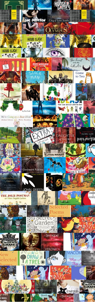
It’s in order (1-100) and does include duplicates. The obvious ones are Patrick Ness’ ‘More Than This’ and a couple of the Wimpy Kids. It was dominated by Cassandra Clare, John Green, Julia Donaldson and Veronica Roth. There were several ‘media’ books on there such as the One Direction annual, a Lego tie-in and an In The Night Garden boxed set. A couple of film tie ins featured – the Mortal Instruments books and also the Hobbit.
But have a look at the colours.
I was surprised, really, at the darkness of the covers and the preponderance of reds and blues. Note that this list covers comics and graphic novels as well as picture books, so it’s very much an umbrella view rather than drilling down to say the specifics of front cover design in middle grade literature.
So what can we tell from this (incredibly precise) research?
Firstly you can tell that I’m in love with John Green’s cover designs. Seriously. And I think Patrick Ness’ front covers are up there too for me.
Secondly, I think the importance of ‘brand’ needs to be recognised. Have a look at the Cassandra Clare front covers. I won’t tell you which they are because, I think, you can recognise them. They’re quite iconic in their styling and consistent – and they do bring your attention to it. This is branding, consistent and swiftly identifiable across the titles in the series. Once you know the branding of these books, you know them. Same goes for Ally Carter and her Gallagher Girls books.
Thirdly, I don’t think anything from children’s literature is *quite* ready to appear in Private Eye’s ‘Bookalikes’ column! The diversity in style is impressive. Though I acknowledge that the colours are, as mentioned, of a distinctly similar hue, I’m struck by the difference between say ‘Diamond’ and ‘Wonder – two front covers which bookend their respective lines. There’s a commonality in that they both feature faces looking out but where ‘Diamond’ has the vivid, almost childlike edge of Sharratt’s drawings, ‘Wonder’ has an incredibly dynamic and almost stark image.
Fourthly, I need to know more about book cover designers. I need to know their names! I think we forget just how good they are and can be. Book covers are, in so many cases, the ‘entry point’ to a text and these have made me swell my Goodreads’ ‘Want To Read’ pile to mammoth proportions. Which is good. It’s very, very good.
And finally? Well, I’d be interested to see whether a similar sort of colour spectrum emerges from the 100 bestsellers (which obviously I shall be doing a post in the near future).
I’m also very, very interested in the absence of obviously gendered front covers on this list. I know through chatting with some of my excellent colleagues on Twitter that it’s very easy to view colours as a sort of semiotic shorthand for character attributes and preconceptions and that’s something I’m keen to avoid. It’s also easy to map these preconceptions and your own experience onto the world of literature (ie: you ‘see’ X, so you expect X to be everywhere – I’m aware this might not make much sense but I will be elaborating on it in the near future) so it’s useful to do an exercise like this to remind oneself of alternate perspectives.
And now, if you’ll excuse me, I’m going to go and buy John Green’s entire back catalogue.

Leave a Reply!